Visual Branding
CREDLY
DIGITAL CREDENTIAL NETWORK
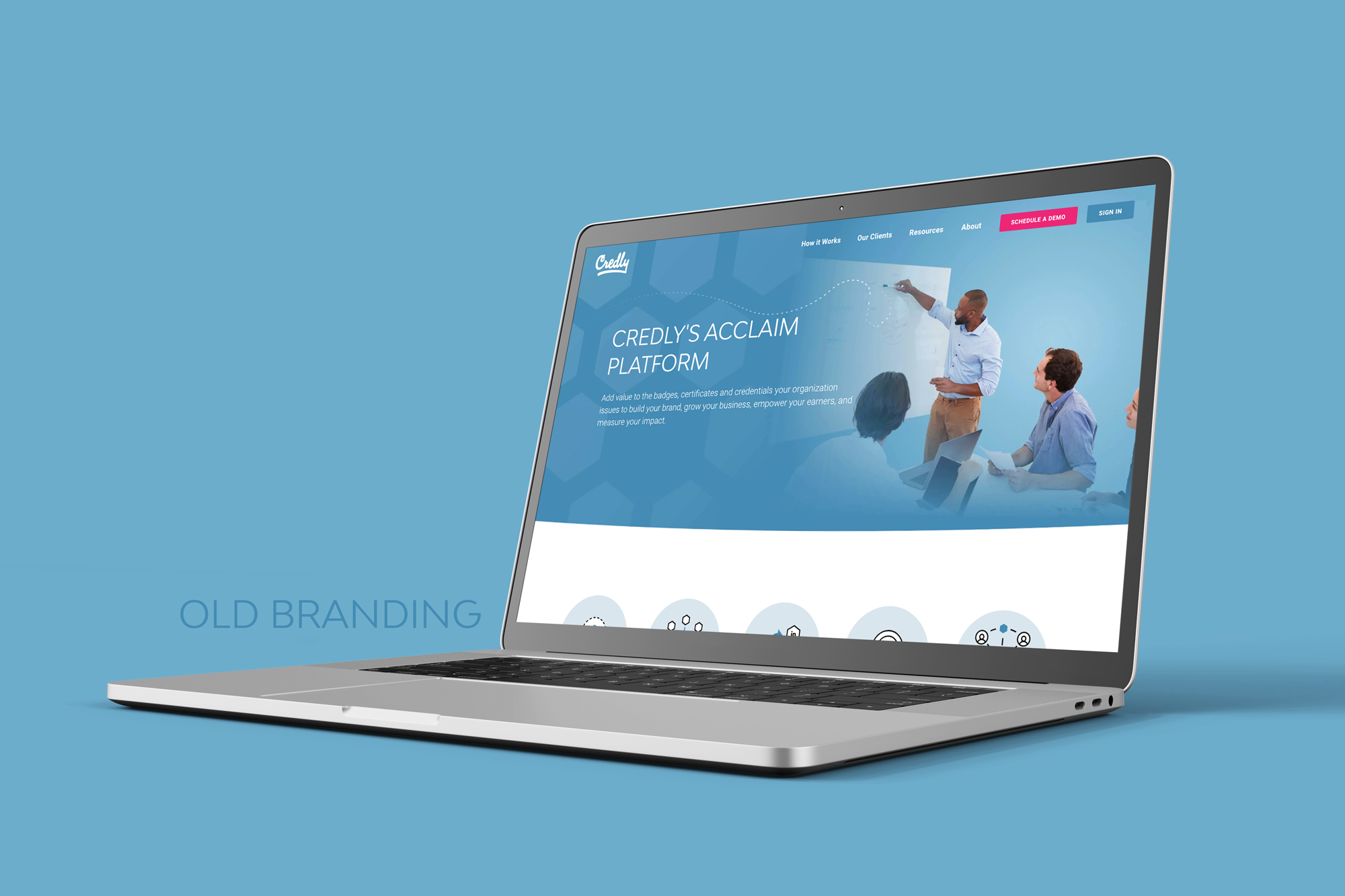

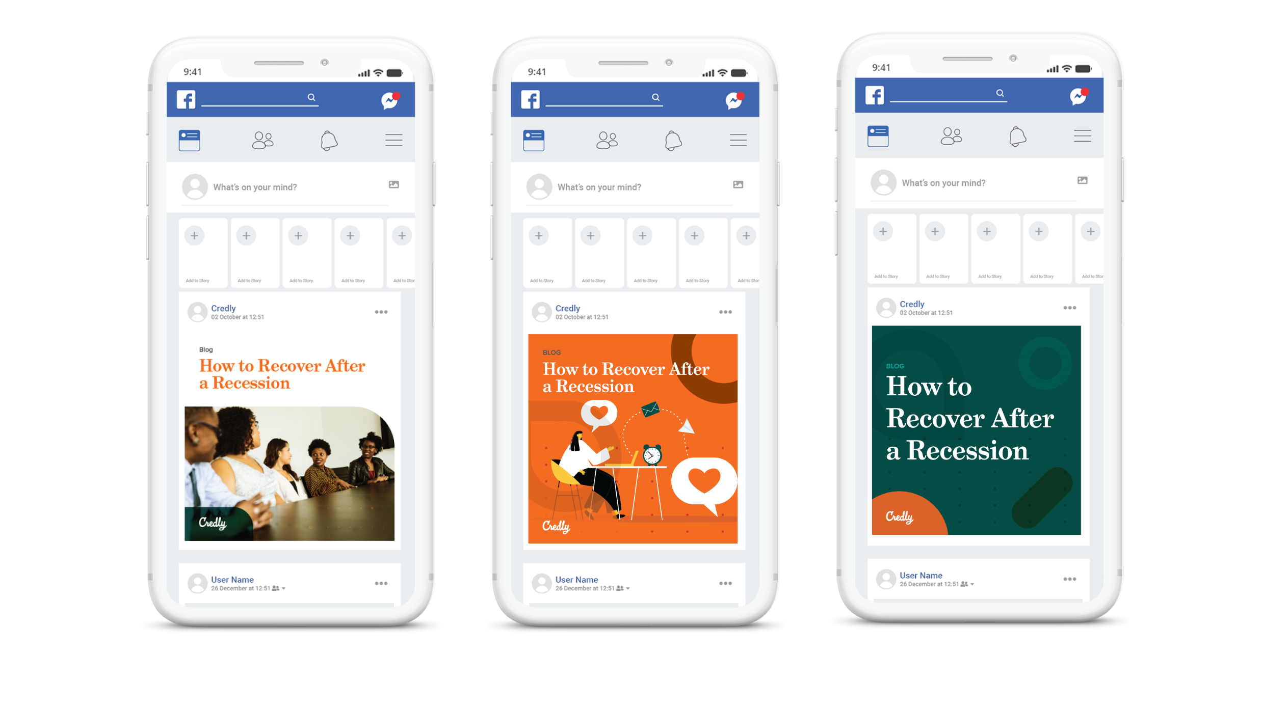
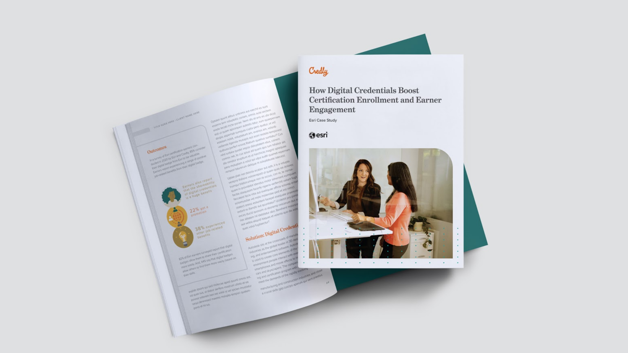
Credly (a Pearson company) is a New York based SAAS company started in 2012. Credly was founded to help people connect their verified abilities to opportunities.
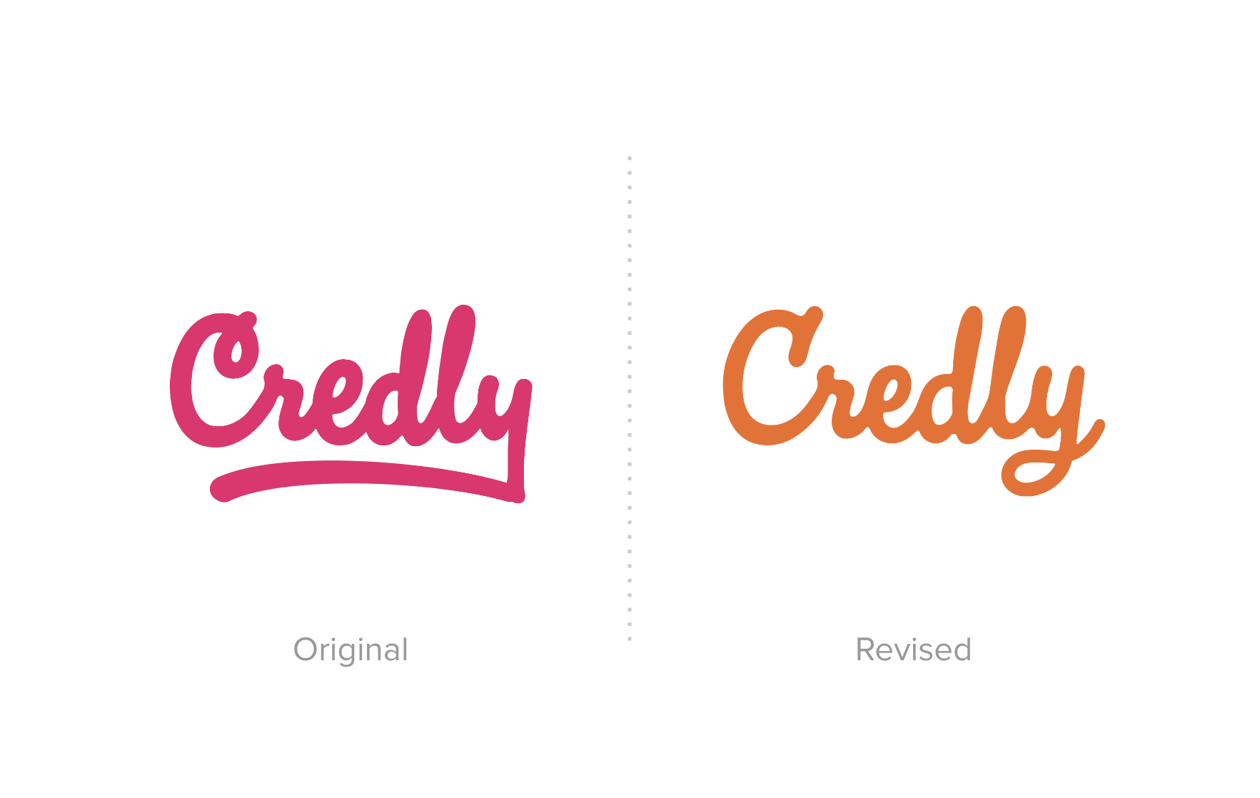
Goal: Rebrand the $5M in revenue company (2020) in 3-6 months and have the brand reflect the company's goal of creating a world where every person can achieve their full potential based on their verified skills. Celebrating achievements and be people-focused.
Plan: Collaborating with the CEO, CXO, and Senior VP of Marketing, we set designated dates to navigate decision-making. My first step in every brand project is a thorough competitive analysis to pinpoint opportunities. We aligned on the goal to craft a brand concept that not only distinguishes them from the competition but also positions them as bold and innovative industry leaders.
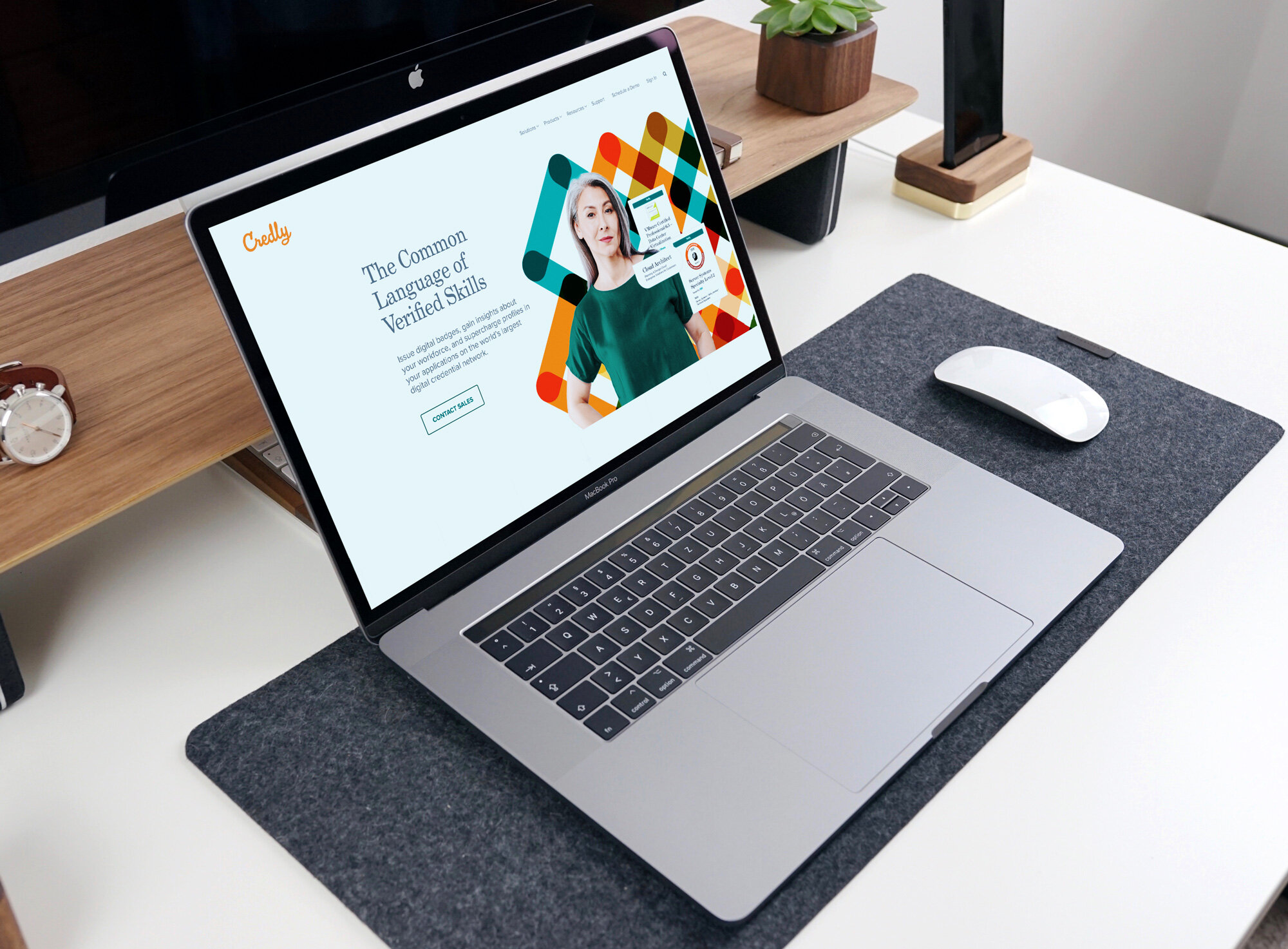
During the competitive analysis, a crucial insight emerged – maintaining loyalty to their bold colors, formerly pink, is pivotal as an industry leader to be visually set apart. They're known for their pioneering spirit, and their unconventional color scheme is a visual manifestation of that. The Credly wordmark logo style is also has a lot of equity and the recommendation of a logo refresh rather than a redesign was well received. Striking a balance was essential – maintaining bold visuals for the B2C (credential earner side of the platform) while introducing a brand that the B2B side could trust, where the revenue resides. Our immediate focus was on revamping the core elements of the visual brand and the website. Collaborating closely with the product team ensured seamless translation of the marketing brand to the web-based product and alignment with the future development of company products.
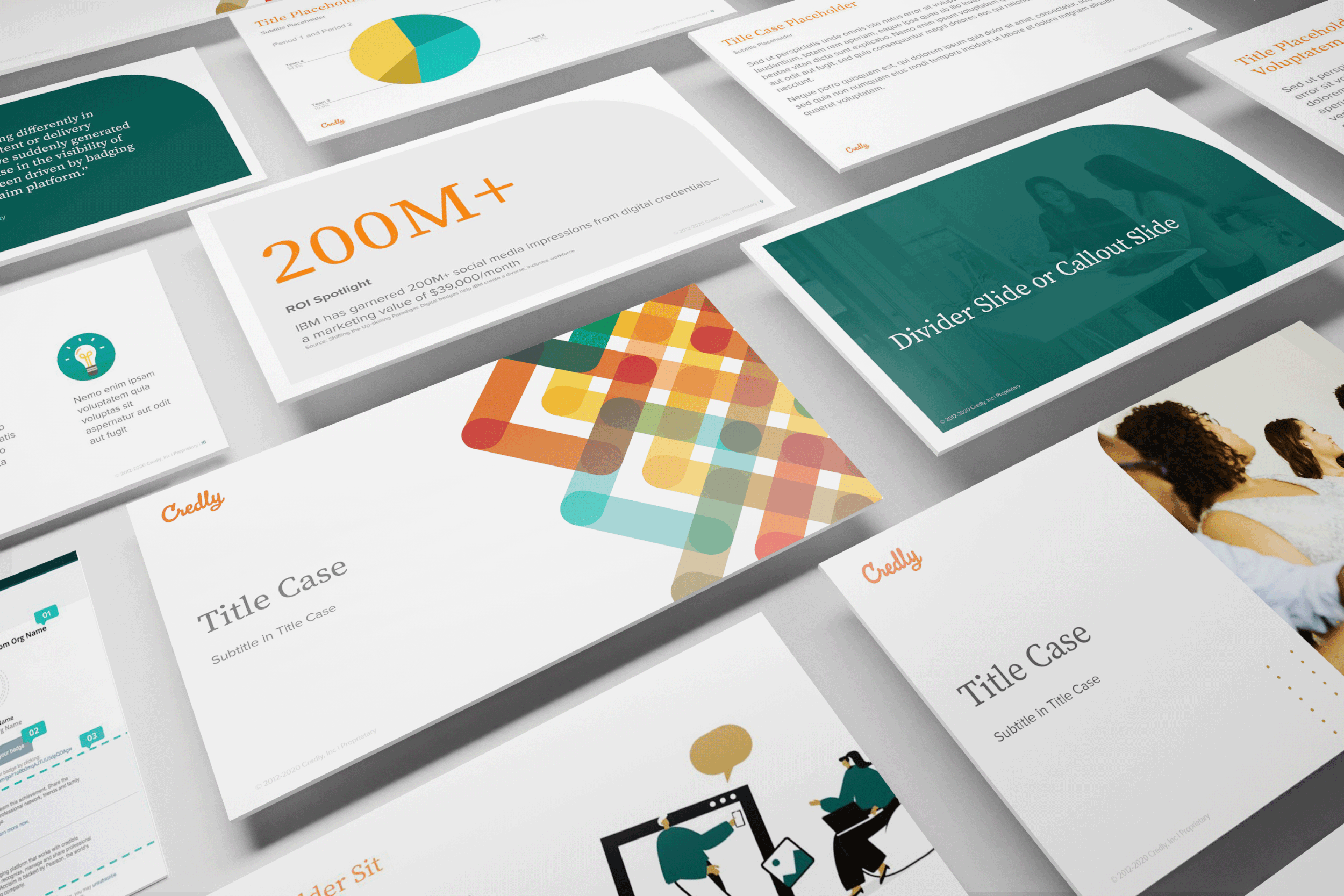
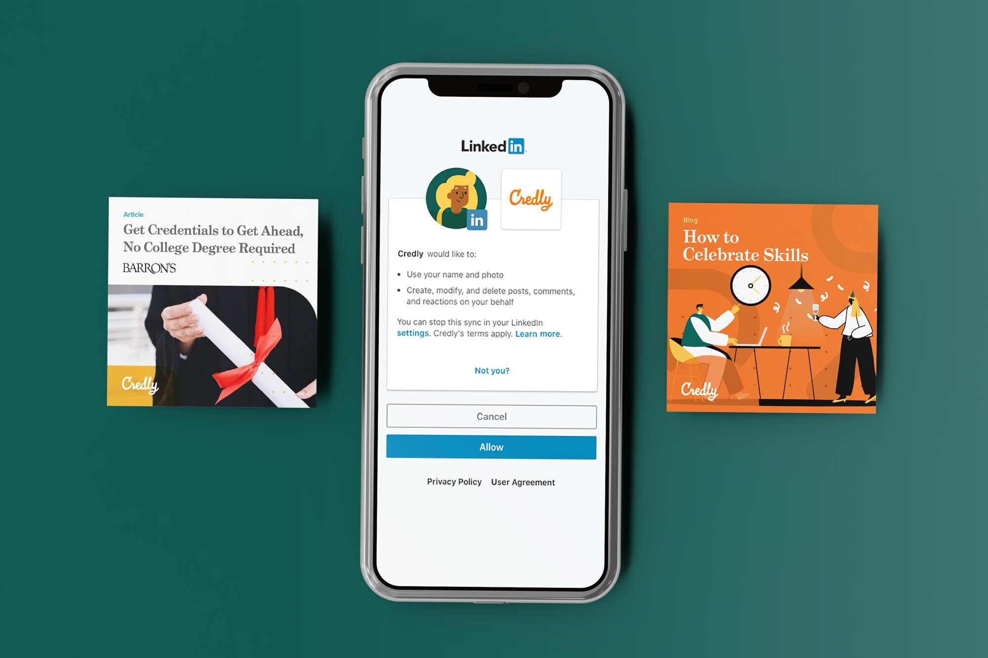
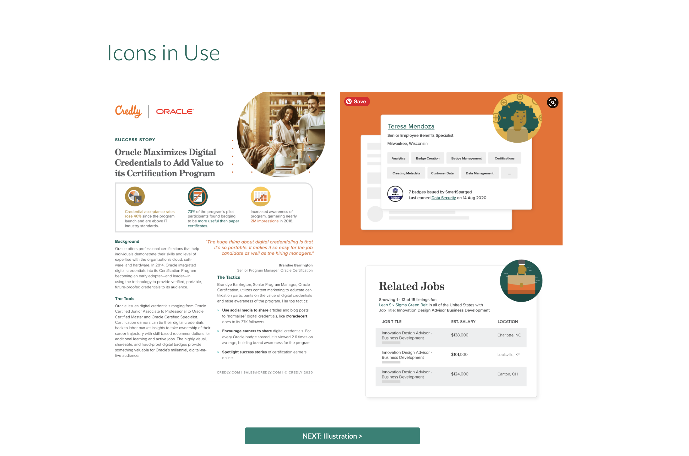
Result: The brand concept of connectedness and credibility. Credly has the largest and most connected trusted credential network. Holding true to their bold palette but refined it with a fresh modern take. The serif typeface Grad was chosen for headlines to give a traditional and “certificate” printed feel, it feels established yet modern. The pattern created represents the network and the trust the company has with its clients. All photography is people-focused and has a warm tint to feel more inviting. Custom icons were created to reflect the design of the credentials on the platform. I also created their very first set of visual brand guidelines and later the brand voice was created based on the same concept. Most importantly Credly’s 2021 revenue rose to $13.3 million.
The Great Exhibition
Creative Co.
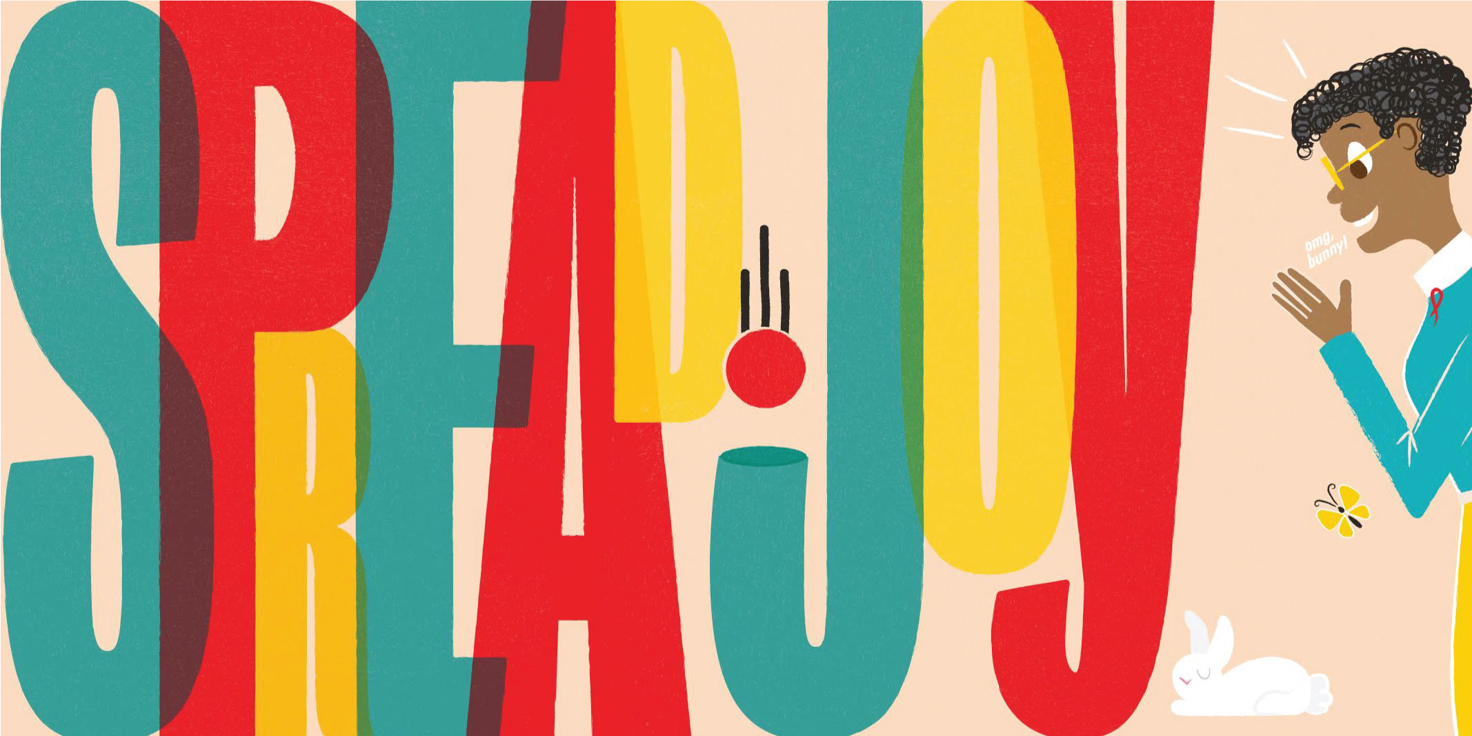
The Great Exhibition is a Fort Worth based creative company I started in 2017. I am currently rebranding the company for a relaunch in Spring. We believe our clients are special and the world should know it. We don’t do dull. Since life is what you make of it, we choose FUN! Our goal is to make work into play without compromising quality and always delivering the best. Everything we create is meant to spread joy in a world that truly is in need of it.
Goal: Create a brand that attracts people and companies that align with our values and goal. Create clear messaging around or focus on branding and packaging. Create visuals and products for the brand with elements that drive our mission forward. Create more brand awareness.
Plan: Taking a mid-century style (roughly 1933 to 1965) approach to ensure everything created feels familiar, comforting, and somehow new. Creating images, posters, a new site, booth, and social presence to create more brand awareness in the following year.
Result: In the works. Check back for more updates.
Martha & Greer
wardrobe consulting
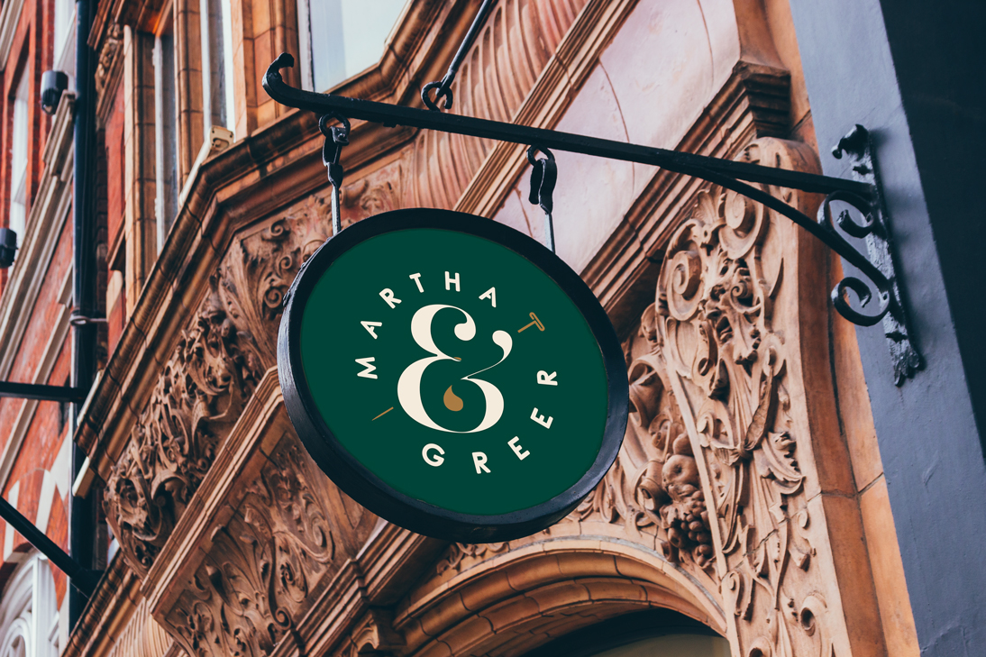
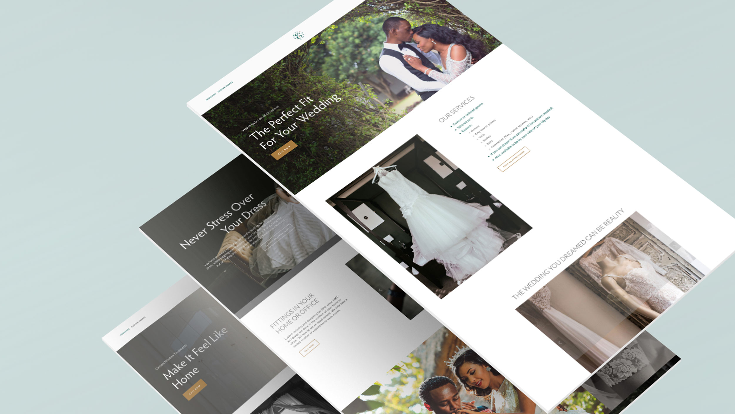
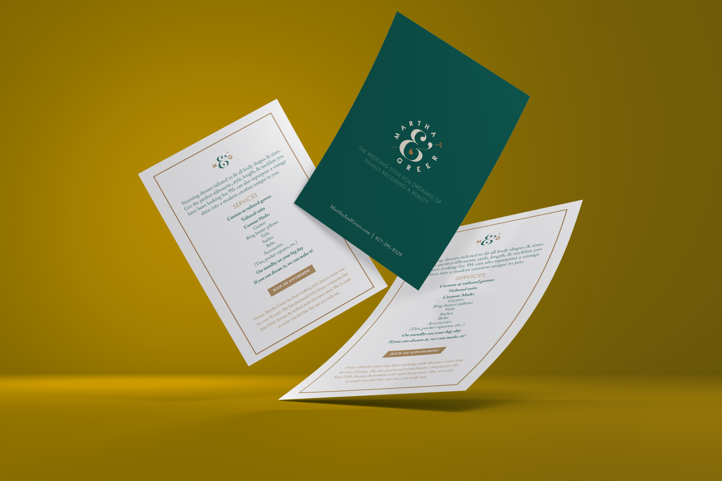
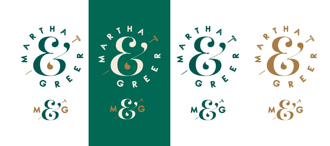
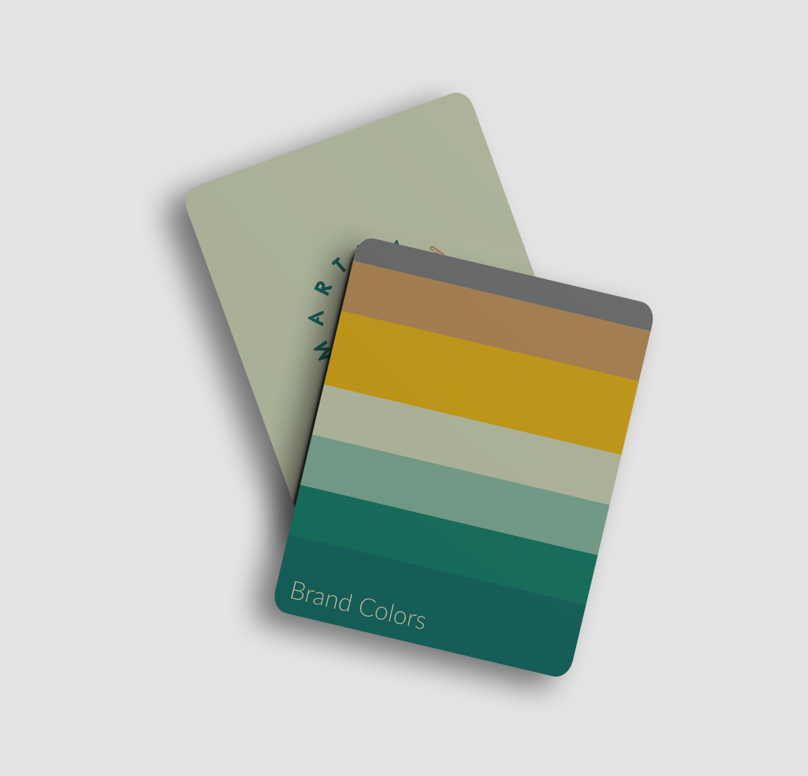
Martha & Greer is a sewing and tailoring company focusing on weddings and special occasions. They make and alter and design custom wedding gowns and more. In addition, they offer custom window dressings often to the newlyweds. Stay tuned, more exciting things in the works with this brand.
Goal: Create a luxury brand and create a website to drive leads. Guide the client to a niche to attract more clients.
Plan: Focus on the client and make clear the messaging reflects that M&G partners with them to make their day the best it can be with less stress. Makes sure the site has great SEO and list the business in all major sites (google, bing, etc) focusing on a small demographic and growing from there.
Result: A well-received new brand from current and reoccurring alteration clients. An early success in PPC ads resulting in a 75% increase in traffic. Ad messaging was A/B tested to ensure the brand messaging resonated with prospects. A 95% increase in the google business listing. We will continue to work with this client to create products and additional services to their clients.
Fort Worth Airpower Council
ORGANIZATION Supporting military troops and their families
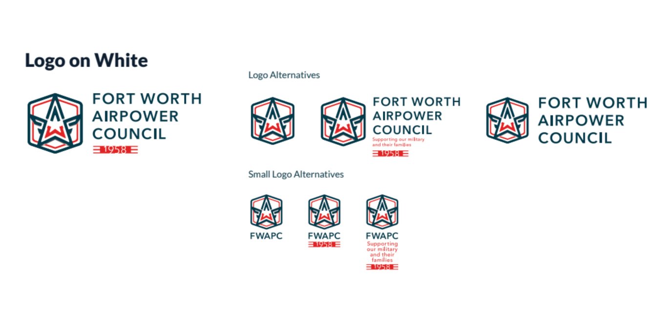
The Fort Worth Airpower Council (FWAPC) dates back to 1958. The FWAPC developed over the years as a 200-member organization and in 1999 the Fort Worth Airpower Council created the Fort Worth Airpower Foundation, a 501 (c)(3) non-profit foundation to raise money in support of our military troops and their families.
I volunteered my time and services as my way of saying thank you to our troops.
Additional Visual Branding examples
